Home and undo buttons look too similar
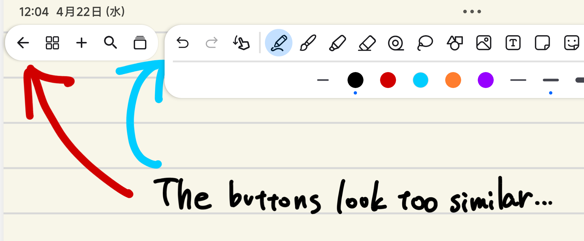
These buttons look too similar, and I often press the wrong one.
I suggest using a house icon (🏠️) for Home button.
- Post type
- 😊 General
These buttons look too similar, and I often press the wrong one.
I suggest using a house icon (🏠️) for Home button.
Log in to comment and vote
No comments yet
Be the first to share your thoughts.