Please fix the folders & files names
Bro look at how the names of my folders and files are displayed now, they cut off, have a weird alignment or are otherwise ugly.
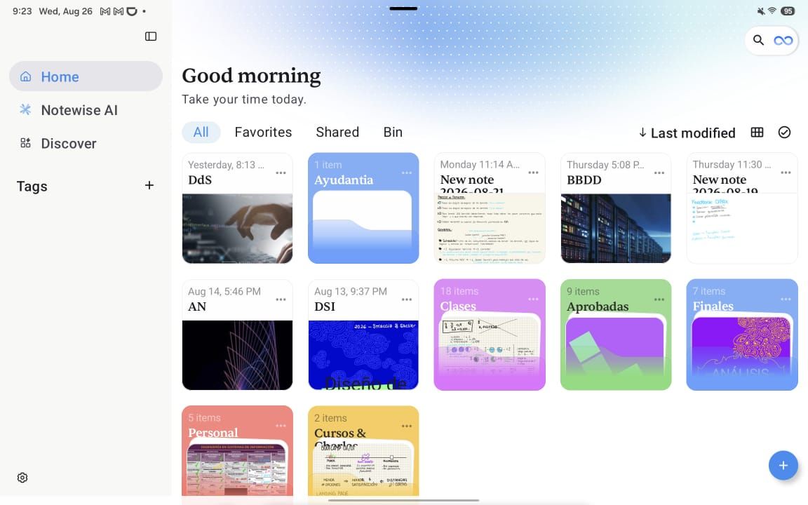
Not sure is the solution is to up the padding or rethink the design, because in that case a long file name would cover the whole thing, and you dont have to support/accomodate for infinitely long names ofc but some of the issues I reported where on ONE WORD names. I didnt love the old folder & file design but this is infinitely worse.
Also a foldable directory tree in the side bar would be a huge help navigating things easier.
- Post type
- 🐛 Bug
Log in to comment and vote
No comments yet
Be the first to share your thoughts.