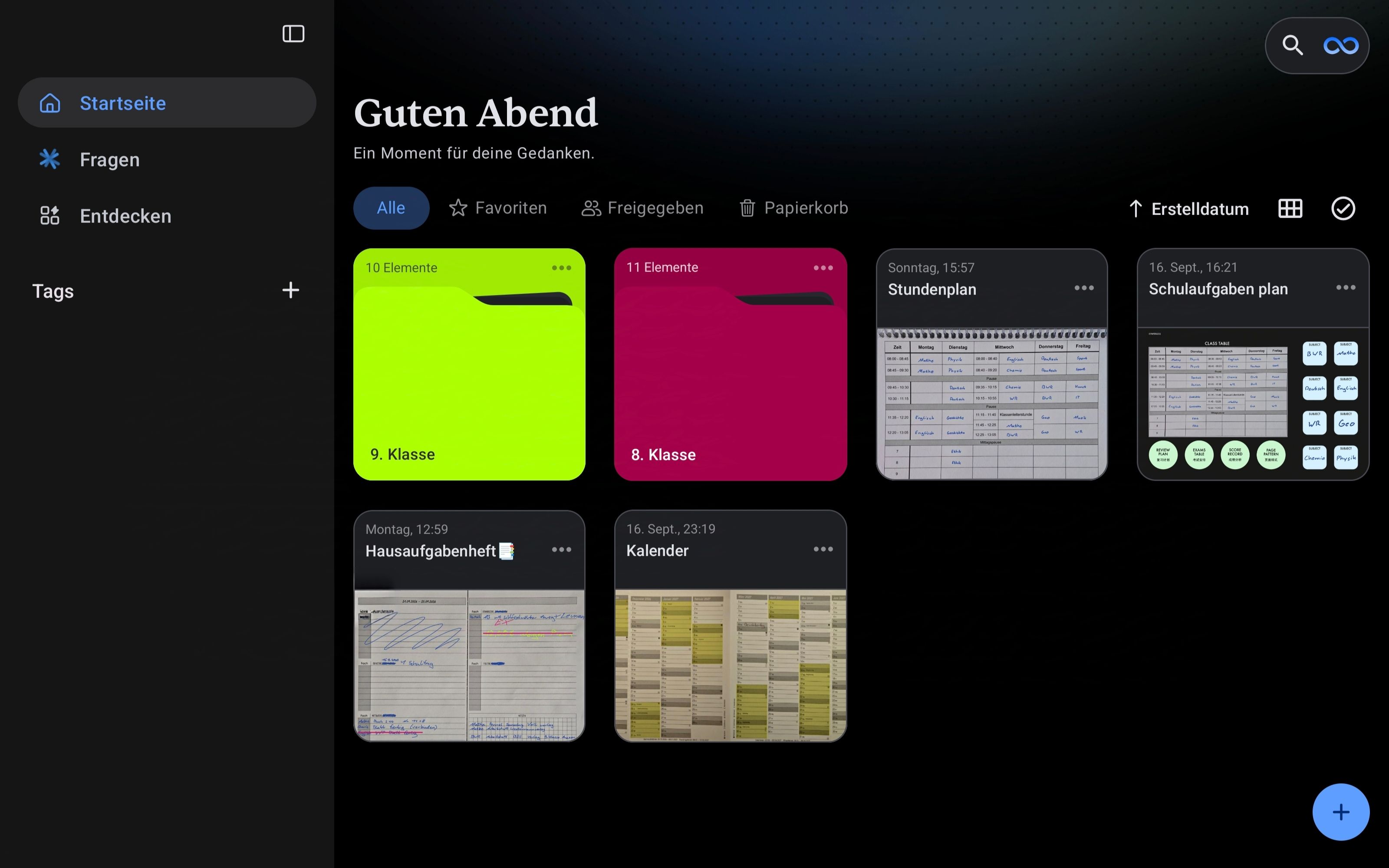
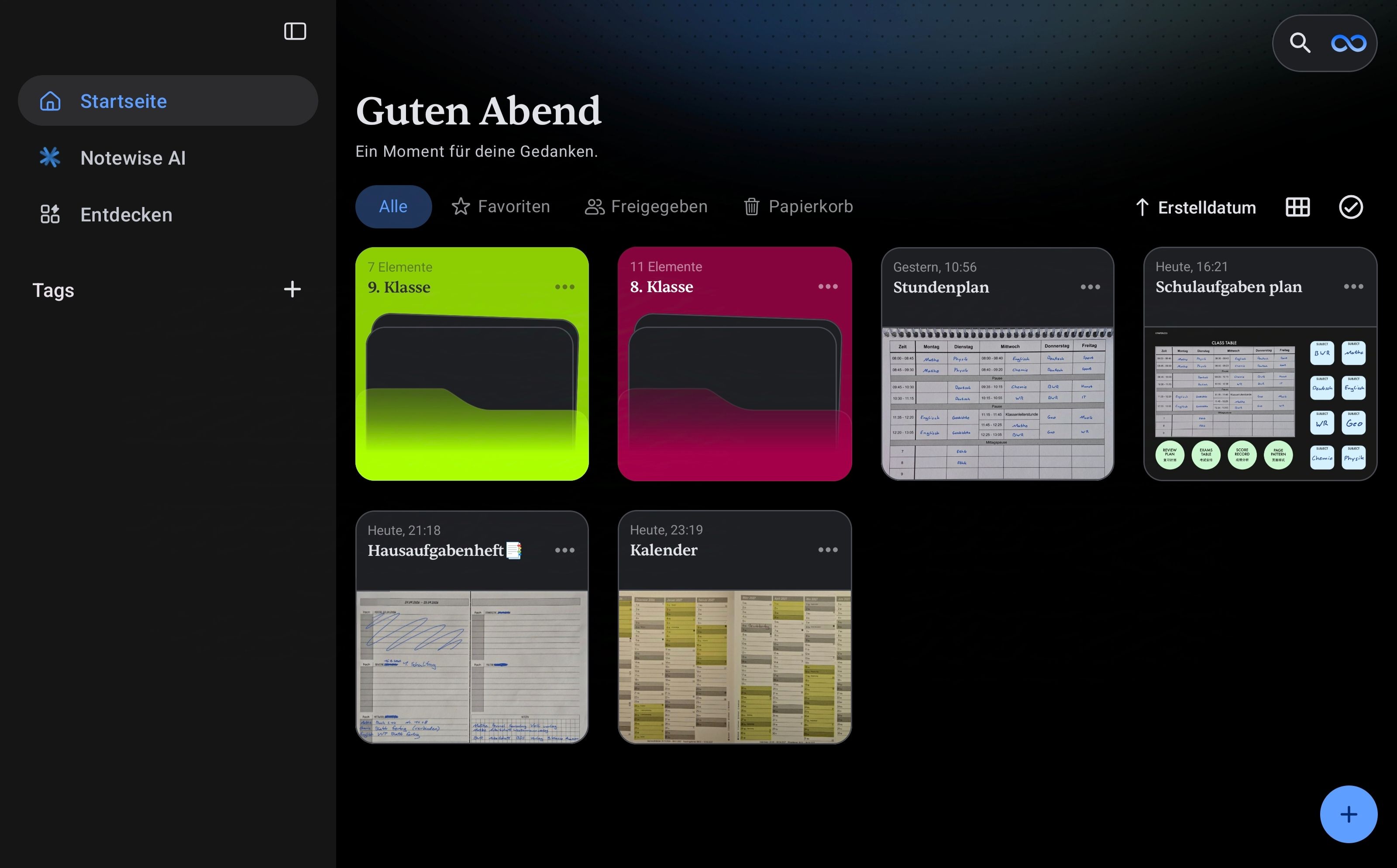
Why did they update the design? It used to be such a lovely design – the folders looked really modern and the font was lovely. And now the folders look completely flat, boring and ugly again, and the font is back to being completely standard! Please reverse this change. The first image shows the new, ugly design and the second image shows the old, lovely design.